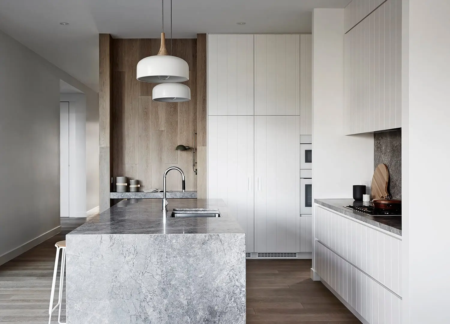
The scullery behind the new kitchen is a favourite inclusion for Dom, noting how it keeps the kitchen looking calm and orderly, especially when entertaining. The kitchen is modern but warm, featuring timber joinery and textural Grey Aether stone in a honed finish from G-LUX. The appliances from V-ZUG bring a clean and modern edge.
When Cera Stribley co-founder Domenic Cerantonio renovated his family home in Melbourne’s east, the most considered decision he made was to get the most out of doing as little as possible.
A leafy, family-oriented suburb, Hawthorn carries a body of post-war modernist homes—houses that integrate landscape, respect orientation and resist the urge to announce themselves. It’s fitting, then, that when Cera Stribley co-founder Domenic Cerantonio came to renovate his own family home here, he drew from that same sensibility. Working with the existing footprint, while decisively editing where needed, it’s now a home that feels generous and considered without being overworked.
How did the original house inform the parameters of the brief?
Domenic Cerantonio: The original house gave us a very clear starting point. There was a lot to love about it. The double-brick construction provided solidity and great thermal mass. The split-level layout naturally zoned the home without relying on corridors. And the north-facing courtyard was a genuine asset—it meant the house already had the bones for beautiful light and passive performance.
At the same time, it carried the hallmarks of its era. There was an overly formal dining room that didn’t reflect how we live as a family, carpet throughout, and a few programmatic quirks—like a laundry attached to the main bedroom. Despite being well positioned on the site, the connection between inside and out felt surprisingly limited. From the outset, we created a very clear list: what to keep, what to edit and what to cull. That simple framework became the basis of the brief.
What were some of the constraints that have shaped the design response?
Domenic Cerantonio: The biggest constraint was self-imposed. We were committed to maintaining the original form and working within the existing footprint. That discipline forced us to be thoughtful and precise. Rather than dramatic gestures, the focus was on small but meaningful moves such as improving flow, refining circulation and enhancing performance. Working with the existing structure, particularly the double brick, meant we had to be deliberate about where and how we intervened. The result feels considered rather than overworked.


“One of the unexpected joys is the view of the city and the sunsets, particularly in autumn and spring. Enlarging the front windows allowed us to properly frame that outlook. It’s a simple gesture, but it brings me a lot of joy.”
– Domenic Cerantonio

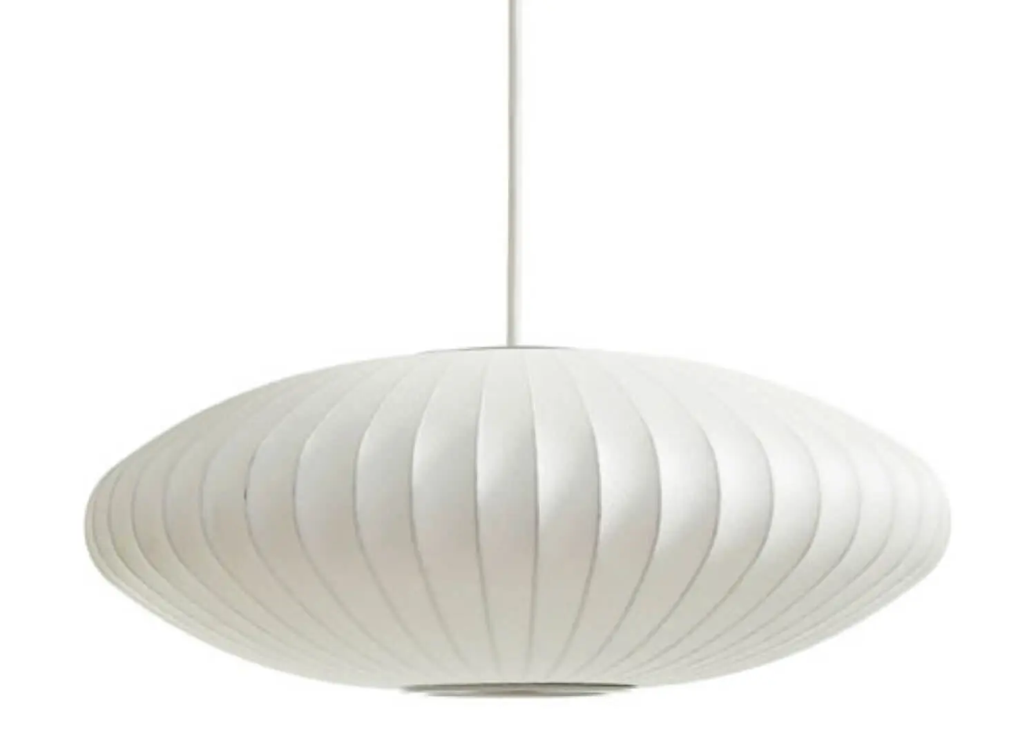
The original timber ceiling was retained and repaired, an important feature and origin story of the home. They’ve been complemented by Kustom Timber Tuscan Villa flooring, Woodmatt Laminate in Prime Oak for the joinery with Grey Aether honed natural stone from G-LUX. A Herman Miller Saucer pendant by George Nelson hangs over the dining table referencing the mid-century era.

What is the spatial planning and program and how does it suit family life?
Domenic Cerantonio: The original layout worked efficiently, so the transformation came through adjustment rather than wholesale change. The entrance places you almost at the centre of the ground-floor living areas. To the right, a short flight of stairs leads to the raised living room—connected, but slightly removed. To the left, past what is now a flexible rumpus room, you move toward the open-plan kitchen and dining area. Beyond that is the secluded parents’ retreat, complete with walk-in-robe and ensuite.
Upstairs, above the living room, a smaller second level holds the kids’ bedrooms and shared bathroom, giving the boys a dedicated space of their own. Small spatial edits also allowed us to create a more secluded main bedroom suite. It’s not a large house, but it feels generous because it works intuitively.
Designing your own home inevitably offers a unique level of testing, were there ideas here you were particularly interested in exploring or stress-testing?
Domenic Cerantonio: I’m probably more pragmatic than experimental. For me, this wasn’t about testing a radical concept—it was about creating a durable family home that could transcend our own tastes over time.
Probably one of the more unconventional moves we did was actually to make the ground floor less open plan. The original plan leaned more open, which on paper sounds appealing—but in reality, we found ourselves wanting greater definition between spaces. There’s a common assumption that a big, open-plan layout is always the ideal. I’m not convinced that’s true. Particularly in a more compact home, separation can actually be more valuable.
We deliberately chose to compartmentalise certain areas to create more dedicated zones. Separating the dining and living spaces, for example, has suited our family immensely. It allows different activities to happen simultaneously without competing with one another. You can have a quieter conversation in the living room while something more animated unfolds at the dining table.

Warm and inviting, because the Cerantonio family lived in the house before renovating there was a clear vision, and understanding of how light moved throughout the day, and how they wanted to inhabit different zones. In the living room, big windows bring light in. Built-in book shelves are paired with a Cassina Utrecht armchair by Gerrit Thomas Rietveld.
How does materiality inform the aesthetic?
Domenic Cerantonio: Materially, it was about warmth and subtlety. The original timber ceilings were important to us. Retaining and restoring them wasn’t the easiest, but they anchor the house and bring a natural warmth that new materials can’t replicate.
Internally, we layered timber flooring, veneer joinery and simple stone surfaces to create something contemporary but not stark. We avoided crisp white walls, opting instead for a softly textured rendered finish that gives depth and softness to the light. That decision was partly inspired by travel—I remember visiting Milan and being struck by the richness of textured grey interiors. There was a quiet sophistication to them. Externally, the rough-cast render over the original brick abstracts and simplifies the form. It feels lighter, more refined, while still grounded.
Has living with the house revealed anything unexpected?
We lived in the house for two years before renovating, which was invaluable. We were able to observe how the light moved, where we gravitated, how we naturally gathered. The design grew out of that lived experience rather than assumption. One of the unexpected joys is the view to the city and the sunsets, particularly in autumn and spring. Enlarging the front windows allowed us to properly frame that outlook. It’s a simple gesture, but it brings me a lot of joy.


Are there aspects of the renovation that feel deliberately understated but have had an outsized impact on how the house works?
At the risk of sounding a bit boring, the scullery has been a game-changer. It allows the kitchen to remain calm and ordered, particularly when we’re entertaining. The outdoor kitchen and awning have also transformed how we use the home. By opening up the northern façade—replacing fixed windows with sliding doors—has had a profound effect. It transformed what was purely a visual connection between inside and out into an effortless, physical connection extending the living spaces into the courtyard and outdoor kitchen. That flow has had a huge impact on daily life.

A north-facing courtyard space opens up with sliding doors—one of Dom’s delightfully favourite surprises. The exterior of the home features a rough cast in soft grey by Rockcote.

In a leafy suburb known for its mid-century homes, respecting this heritage, Dom decided to work within the existing size of the home rather than adding or extending, which allows the original character to shine through.