We chat to seven Australian designers that took to Milan’s global stage to unveil new products and design collaborations.
Flack Studio x Volker Haug Studio
Me and You
Via S. Maurilio 18, 20123 Milano MI, Italy
Congratulations on your ‘Me and You’ lighting collection, a series of decorative light fixtures you co-designed. When did you decide an idea borne from a damaged vintage sconce should be explored as a collection?
DF: The Volker Haug team came back a week after this original site-specific fitting, and they said – how about we do something in Milan? It was so easy working together in that moment; it proved that we could go bigger with it and have even more success. But the catch was we had to design, produce and ship it within six months. We set the program, and off we went! It was instinctual; there was an appreciation and respect that led to a wonderful collaboration.
VH: Our studios work and collaborate in a very similar manner. We deal with resolution through design and rope in different voices from the team in a similar way. There is that immediate and very fluid nature in the working relationship. And yet, you can still feel each of the studios’ individual styles and distinct voices in the final collection.
How did this develop from the initial collaboration?
DF: We thought it’d be fun to explore a level of constraint and see where that would take us. With quick experimentation, you start to realise that constraints are not really fun, are they? That’s when the idea of Me and You really came up.
VH: The design evolution was so natural. We began scaling ideas up or down or applying different patterns in the metalwork across various fixtures. The final collection is very diverse, but you recognise some of these throughlines and themes, even across different materials or finishes.
How does ‘Me and You’ express your shared design values, individual aesthetics and approach to materiality?
DF: Our reverence for the materials is our connective tissue. We both approach design with a lot of playfulness and humour.
VH: We could work with our favourite materials, like glass, brass and fibreglass. The Flack team uses them often in interiors, and we use them in our lighting. It was a seamless crossover between these perspectives and how the materials could, and ultimately did, apply to the collection.

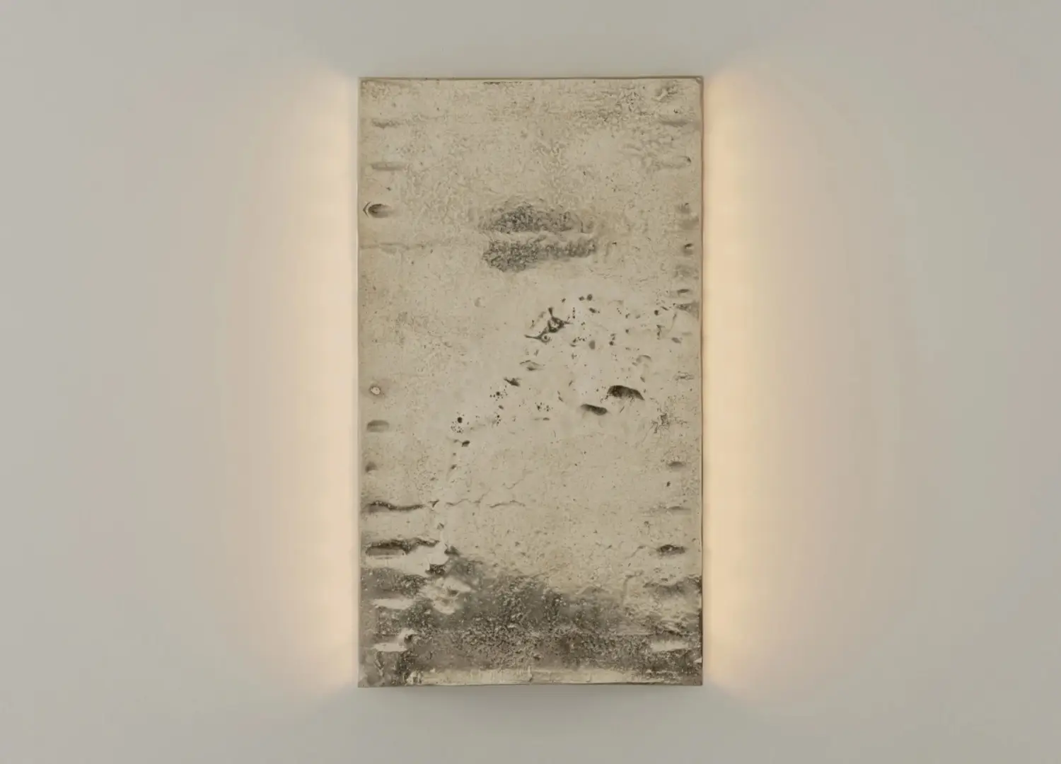
Melbourne-based lighting designers Volker Haug Studio and multidisciplinary design studio Flack Studio presented ‘Me and You’ – a series of decorative light fixtures they co-designed for Milan Design Week | Photography by DePasquale+Maffini

The ‘Me and You’ collection by Flack Studio x Volker Haug Studio | Photography by DePasquale+Maffini
Can you share more about the dualities the name of the collection ‘Me and You’ refers to?
DF: We found the engagement between light – Volker’s expertise – and space – our specialty – to be critical. It was a partnership between the two, with really specific considerations resulting in the final designs.
VH: Each fitting started taking on its own character, seeming to develop personalities through design characteristics. So, some lights express a more constrained, demure feeling, and others feel more expressive or boisterous.
Why did you decide to present/launch the collection in Milan?
VH: We have exhibited in Milan several times before. There’s no better place in the world to exhibit, as the international design community really comes together. Dave is fond of Milan as well, so the exhibition here was a given for us.
DF: We bump into each other almost every year in Milan for design week, and it’s always unarranged! This time, we, of course, made it official.
What was the concept behind the exhibition design – how did it come together?
VH: Combining our hard metal materials with Flack’s soft interior materials made for a beautiful narrative in the actual exhibition space in Milan. There was a dialogue between Flack’s choices and the fibreglass, brass, and nickel of the lighting series.
DF: We played on the colours associated with Australia and wanted to make sure that showed up in the installation. After all, this is a very Australian collaboration! But it was an organic overlap with the colours of Milan. There is the romanticism and natural colour spectrums of green greys, the lush golden tones of the carpet, and the suave finishes on our custom walnut furniture centrepiece. It all made for an easy translation to the Milanese cobblestone street we were located on.
Lastly, how was the collection received?
VH: It was wonderful to hear everyone’s reactions to the collection. We had a lot of friends come through, but even more exciting was meeting people who were not familiar with Australian design who were blown away by what we had produced.
DF: Our opening reception spilled out onto the street. The community really showed up to support us, and it set a very celebratory tone for the whole of design week.

Located in Milan’s 5VIE district, the exhibition space juxtaposed the hard brass, fibreglass and nickel lighting series with soft interior materials | Photography by DePasquale+Maffini
Don Cameron
Translations
Via Vittorio Emanuele II, 48, 20814 Varedo MB, Italy
Congratulations on ‘Translations’, what was the genesis of this collection?
Don Cameron: ‘Translations’ was a response to an earlier body of work, ‘Communion’ – a slow photographic project that came from a desire to lens concrete buildings as pure sculpture. This personal project occurred over the course of 20 years. Having presented ‘Communion’ at Gallery Sally Dan–Cuthbert in 2020 and being conscious of my design of unique furnishings for my interior projects, the gallery encouraged me to work on functional objects for my next solo showing. As a gallery that sits at the intersection of art and design, they enabled me to work in both modes. It felt natural to use the former body of work as a starting point for the collection.
‘Translations’ is described as a merging of design, architecture, and sculpture. How have you translated the forms and surface patina from your photographs into the objects?
Don Cameron: I liked the idea of the collection beginning as architecture, becoming an image, and then an object – moving through dimensions. All objects have shared origins in architecture. The aspect of the architecture I wanted to foreground informed a material search to best describe each outcome. In this way, I saw the potential of coarse clay to describe the surface patina and weathering of the structures I photographed, the architecture that was graphic or cuboid, I looked to an even sharper rendering using linished stainless steel. The poured form of the Atlantic wall structures I photographed – where concrete was used as form and structure – liquid stone, compelled me to make the desk and stools completely out of timber with all joints concealed to give a similar read of total sculpture.
‘Translations’ beautifully explores materiality, such as the Black Spanish clay and glazes in the Oblique coffee table. How did you work with makers such as Simon Reece to achieve your desired outcome?
Don Cameron: I was very lucky to work with small workshops and skilled ateliers I rely on for my interiors work, but in the free zone of the gallery space – without a particular space, client, budget or timeframe in mind. I felt lucky to find Simon, who lived only 30 minutes up the (Blue) Mountains from me.
Simon has his own artistic practice which has taken him and his family from Sydney to Japan, Spain, and back. I persuaded him to be the ‘hands’ that I could direct towards the desired outcome. We spent several months working on glaze tests and then the design of moulds that would enable the wire-cut face to the tiled elements that would catch the glaze. Similarly, working with Luke Tosic and his team at Élan Construct on the wooden objects was a process of drawing then prototyping in order to arrive at the blunt forms and silhouettes of the desk and stools. The metal objects started in Sydney ateliers, then finessed, and are now produced in the famous workshops of Italy’s Cantu region.

Australian interiors and object designer Don Cameron presented ‘Translations’ at Alcova’s Villa Bagatti Valsecchi during Milan Design Week | Photography by Piergiorgio Sorgetti

‘Translations’ by Don Cameron for Milan Design Week 2024 | Photography by Piergiorgio Sorgetti
Why did you decide to present ‘Translations’ in Milan as part of Alcova?
Don Cameron: I owe that in large part to a chance meeting with David Caon one morning over coffee, who mentioned that Tom Fereday had presented previously at Alcova and was presenting again this year. I was in Northern Italy last September with my partner and set up a meeting with Alcova founder Valentina Ciuffi, which she forgot about. It ended in a wonderful evening around a dinner table with a small group of friends who have remained just that. The concept of Alcova staging presentations of designers in semi-derelict or abandoned places spoke to the fundament of ‘Translations’, my photography of obsolete or forgotten buildings. Further, I wanted to present the objects in the open field of Milan Design Week alongside designers from other countries and cultures and have them exposed to and experienced by an international audience.
Why did you select the area you did at Alcova’s Villa Bagatti Valsecchi, and how did you approach the space in terms of curation?
Don Cameron: Once accepted to present at Alcova, your presentation requirements are assessed and spaces that work with the overall curatorial itinerary Valentina and co-founder Joseph Grima have in mind are offered for your consideration. I was lucky with my space as the architectural volumes and light worked so well with the objects. I plinthed the objects so they appeared separately within the space. It was actually relatively simple to conceive as you were not able to touch the walls or floors of the historic Villa Bagatti Valsecchi. The proportions, the light, the terrazzo Veneziano were perfect cadence to the objects.

Translations comprises a series of eight furniture and lighting objects, including the ‘Bloc’ lamp, ‘Bloc’ sofa and ‘Oblique’ coffee table in ceramic | Photography by Piergiorgio Sorgetti

‘Translations’ by Don Cameron for Milan Design Week 2024 | Photography by Piergiorgio Sorgetti
How was the furniture and lighting collection received?
Don Cameron: The objects were very well received by a cross-section of attendees from diverse cultures and backgrounds. Each day at Alcova was equally enthralling and unpredictable. Half an hour in a day might look like talking to a design practice from Estonia, then a gallery from Iran, before explaining the collection to a Chinese interpreter who in turn translated to a Chinese tour group, then being interviewed by a radio station from Design School Eindhoven, a bus load of Australians, talking to furniture producers, collectors, students and galleries about the works and their backstory and material decisions and processes. It was wonderful to hear how people from different cultures described the collection of objects and the words they used. It gave me a very kaleidoscopic understanding of things that came intuitively and directly to me. The camaraderie, the shared language, the universality of ideas expressed as design is equally humbling, inspiring and empowering.
Nicci Kavals | Articolo Studios
Articolo Home by Founder Nicci Kavals
Via Solferino 44, 20121 Milano MI, Italy
Congratulations on the launch of ”Articolo Home”. Where did the idea for this furniture capsule begin, and how does it build on what you have achieved with your bespoke lighting range?
Nicci Kavals: ‘Articolo Home’ represents a natural progression in the evolution of Articolo Studios. The idea for this furniture capsule began with a desire to juxtapose texture and tactility. Through the use of hand-finished metals, Italian veneers and exquisite leathers, we’ve crafted a collection that speaks to timeless sophistication.
Drawing inspiration from the enduring palette of heritage fashion houses in Europe, we’ve curated earthy hues like latte, olive, burgundy, and camel. These hues evoke a sense of warmth and comfort, inviting people to feel at home with our furniture.
Can you share a little bit more about the inspiration behind the collection?
Nicci Kavals: ‘Articolo Home’ embodies a fusion of my admiration for Belgian architecture, Italian classicism, and a reverence for contemporary minimalism.
At the heart of the collection is an organic and intuitive design process, coupled with a deep appreciation for the intrinsic beauty of hand-worked natural materials. Collaborating with master practitioners is essential to maintaining the meticulous craftsmanship that defines Articolo Studios Home range.
How does the furniture collection express your design values while also capturing your aesthetic and approach to materiality?
Nicci Kavals: My approach to design is characterised by meticulous attention to detail. I balance functionality with a timeless aesthetic while blurring the lines between design and art.
The furniture collections exemplify this philosophy, rooted in a dedication to artisanal craftsmanship. Collaborating closely with master artisans, we cultivate a deep appreciation for their expertise, resulting in pieces that showcase the nuances of superior materiality. Each element speaks to our commitment to quality and craftsmanship, from hand-cast metals to Italian veneers and leathers and intricately hand- dyed straw marquetry.
Why did you decide to present/launch ‘Articolo Home’ in Milan as part of Fuorisalone?
Fuorisalone is the largest and most prestigious furniture and design fair in the world, attracting the design community from all over the world. Thus, it is the right platform to debut ‘Articolo Home’.
In 2019, we exhibited at Salone del Mobile.Milano during Milan Design Week launching our lighting collections into the European market. This was a huge success. This year, we return to the precinct in the heart of Brera.

‘Articolo Home‘ saw the launch of a new furniture capsule by Melbourne-based Articolo Studios founder Nicci Kavals for Milan Design Week | Photography by Thomas De Bruyne

‘Articolo Home‘ for Milan Design Week 2024 | Photography by Thomas De Bruyne
The use of colour is new for Articolo; we purposely chose these colours as they reflect haute couture palettes through the decades and separate the furniture smalls category from the lighting category within our business.
Thankfully, we had a great team on the ground in Milan to inspect the space, measure, and check samples. Approaching the space for the first time was both exciting and terrifying, as we arrived just as the fit-out of the space was being completed.
Lastly, how was the furniture collection received?
Nicci Kavals: The reaction from past and new clients and specifiers from across the globe has been outstanding. It is a very proud moment for me and my exceptional team and I feel validated having our furniture already specified into projects by clients who experienced the collections first-hand in Milan, as well as those who looked on from afar.
Milan serves as a stage for designers, providing unparalleled opportunities for international exposure, access to resources, design and cultural inspiration, and authentication within the global design community.
You exhibited within a two-level gallery space with vaulted ceilings and arches. How did you approach the exhibition design for ‘Articolo Home’ in this historic space?
Nicci Kavals: Studio Goss director David Goss, long-time collaborator with Articolo Studios, perfectly informs Articolo spaces with his sensitive design approach and exploration of artisanal architectural brilliance and sophistication.
For the furniture smalls launch in Fuorisalone, we wanted a space with architectural merit and rich character to provide a canvas for Studio Goss. In this instance, we found a gallery in the heart of the Brera design precinct with breathtaking vaulted concrete ceilings and columns.
Studio Goss designed a series of insertions in glossy deep burgundy and olive green to reflect the accent leather colours from some of our collections, mirror and pressed cement to punctuate the space. These insertions are a combination of low plinths and higher standalone walls and mirrors, carefully curated to frame a series of vignettes and to create key ‘moments’ as you walk through that space, not revealing everything at once.

‘Articolo Home‘ for Milan Design Week 2024 | Photography by Thomas De Bruyne

Melbourne design studio Studio Goss director David Goss and long-time Articolo Studios collaborator designed the exhibition space within a vaulted gallery in the heart of Milan’s Brera Design Precinct | Photography by Thomas De Bruyne
Fiona Spence and Wanda Jelmini
Innate Collection
Via Ciovasso 17, 20121 Milano MI, Italy
Congratulations on your inaugural Innate Textile collection, which is a testament to your enduring collaboration with Wanda Jelmini. What is the genesis of this collection, particularly the decision to pay homage to the Australian landscape?
Fiona Spence: Innate began by looking at the question of a contemporary Australian aesthetic, unpacking the way we interact with our country and how this shapes who we are as a people. Learning from the profound story telling of the Australian indigenous people, we as the more recent immigrants to this land must tell our own. Innate textiles demonstrates a response to this land by two passionate textile designers.
How do the first three Innate Textile collections draw on the works of prominent painter Luke Sciberras?
Fiona Spence: When we began to look at the possibilities of this land being our muse it seemed to make sense to look at others who draw from the same inspiration. One of Luke’s paintings, ‘Ilford Waratahs’, caught my attention immediately and I knew then that we had found the inaugural source. Luke was very excited by the idea, so I spent some weeks trawling through his back catalogue to find works whose visual motifs might lend themselves to the nature of weaving and repeat pattern making. For us, it was never about directly translating his work via print to cloth but more about allowing stories to develop in collaboration with the talented weavers we work with to interpret our designs and his work.
The towel collection is manufactured in Portugal, while the textiles are manufactured by selected specialists worldwide. How you have worked with these specialists to create the highest-quality design outcome?
Fiona Spence: The joy of textiles is the fact that the process collaborates with the designs. Some things cannot be rendered directly, meaning we needed to source weavers who were both equipped and willing to push the boundaries of their craft. Inspired by the land, the organic design of the towels motivated us to use a specialist weaver from Portugal whose six-colour jacquard machines allowed us to realise the designs while delivering luxurious density and weight.
Wanda’s thirty years of experience has enabled us to engage with our weavers in a way that clearly communicates the desired outcome of our products while also challenging them to push their creative boundaries. We are lucky to work with weavers who are experts in their craft – one in particular is currently weaving for Chanel.

Innate textiles was founded by Australian Fiona Spence and Italian Wanda Jelmini as a unique exploration of the Australian landscape | Photography by Carlo Magnoli

The first three Innate textile collaborations were presented in the apartment of the brand’s Italian general manager in Milan’s Brera district | Photography by Prue Ruscoe
How was the Innate Textile collection received?
Fiona Spence: It has been a long and arduous road for Innate, so it was particularly gratifying to see how many people truly loved what they were seeing. They genuinely felt the collection was beautiful and certainly nothing they had seen before. Creating a textile collection has been a life-long goal of mine and it is wonderful to know we are not only pleasing ourselves.
It has been wonderful to receive so much positive feedback, but the constructive feedback has also been invaluable for our learning. One agent who, ironically, loved the collection, also expressed that we would do better to create an Italian brand that takes inspiration from ‘nature’ – a comment that has fuelled my determination to ensure we translate that our products are beautiful and unique because they are Australian, this is our point of difference.
You first presented the two inaugural releases at Maison et Objet in 2024. Why did you decide to showcase the collection as part of Milan Design Week?
Fiona Spence: Innate garnered a global network of agents and distributors during M&O, some of whom had only seen the collection digitally. It was important to allow those agents and their sales teams to see the collection properly and hear about the story ‘straight from the horse’s mouth’. Milan Design Week is not only about showcasing to the wider community, it’s also an opportunity for global companies to connect with their extended sales teams. I’m proud to say Innate Textiles is a global company; even if just at the beginning of its lifecycle.
Do you think presenting the collection in an apartment in Milan’s Brera district offered a better understanding of how the collection may be experienced in a home?
Fiona Spence: The apartment was the home of our Italian general manager. Being downtown in Brera during FUORISALONE felt like the perfect place to be. We were only available to our agents and selected guests by appointment, so it felt relaxed and pleasant in a comfortable setting where the pieces might reasonably live.

The Innate collection by Fiona Spence in collaboration with Wanda Jelmini | Photography by Prue Ruscoe

Christopher Boots designed the ‘CRUX’ exhibition during Milan Design Week to emulate a night sky filled with stars, echoing the Southern Cross constellation inspiration behind the series | Photography by Annika Kafcaloudis

‘CRUX’, a new luminary series by Melbourne-based lighting designer Christopher Boots, marks the first time the designer has worked with blown glass | Photography by Annika Kafcaloudis
Christopher Boots
CRUX
Via Ciovasso 17, 20121 Milano MI, Italy
Congratulations on the launch of your latest luminary series ‘CRUX’. Where did the idea for ‘CRUX’ begin, and how does it reflect a new direction for your studio?
Christopher Boots: I’ve always loved the night skies, eyeing the constellations above. ‘CRUX’ was inspired by a desire to honour our place in the southern hemisphere. As an object, it represents a new practice for us – exploring new materials and stepping beyond our signature work with quartz crystals. We were drawn to the organic, magical quality of hand-blown glass and partnered with the amazing folks at Hothaus in Melbourne. With their know-how and our curiosity, we dove headfirst into exploring natural forms. This has been a thrilling chapter for our studio, evolving our work while staying true to a high calibre of craftsmanship.
Can you share more about the inspiration behind the collection, in particular, the Southern Cross star constellation?
Christopher Boots: ‘CRUX’, commonly called the Southern Cross, is one of the most identifiable constellations in the southern sky and a guide for travellers since ancient times. It’s a recognisable symbol with deep meanings here in the Southern Hemisphere. With ‘CRUX’, I wanted to capture that guiding light and form of the stars into a tangible form of beauty, a reminder of our universe. Each piece in the collection brings a bit of that starlight indoors.
How have you explored new methods and materials, such as blown glass and brass finishes, through pendant and sconce variations?
Christopher Boots: We’ve been experimenting with blown glass to see how it plays with light, partnering with local artisans to get it just right. Chasing the magical, fluid quality of glass is like capturing the unpredictability of space. Pairing with the solid, earthy feel of brass, it balances out to create a balance that sings.
Why did you decide to present/launch ‘CRUX’ in Milan as part of Fuorisalone?
Christopher Boots: Why wouldn’t you? Milan is the nexus of design, creative energy, and new ideas. Launching the ‘CRUX’ collection there allows us to bring our work to those who truly appreciate innovation, beauty, and craftsmanship beyond our own shores.
How did you approach the exhibition design for ‘CRUX’ in Milan?
Christopher Boots: I thought of Antoine De Saint Exupery’s book, The Little Prince. He steps onto a small moonlit planet suspended in starry, untamed night. The ‘CRUX’ exhibit was designed to feel like stepping into another world: early, rocky, and under a night sky filled with stars.
Lastly, how was the furniture collection received?
Christopher Boots: Feedback on ‘CRUX’ has been overwhelmingly positive. It’s super encouraging to see people connect with our design and appreciate how we incorporated elements of the night sky into each piece. That kind of reception makes all the risk-taking and late nights totally worth it.
Milan is cultural oxygen. A quote by Isabelle Olson comes to mind: “The role of the designer is to rehearse the future.” If you’re interested in creating a better future worth living in, Milan offers that opportunity, a place and time for conversations and connections on the global design stage.

Lighting designer Christopher Boots | Photography by Annika Kafcaloudis

‘CRUX’ by Christopher Boots for Milan Design Week 2024 | Photography by Annika Kafcaloudis

‘CRUX’ by Christopher Boots for Milan Design Week 2024 | Photography by Annika Kafcaloudis

The ‘Mazer’ collection is a series of small-run handmade pieces crafted from Roman travertine by Sydney-based designer Tom Fereday. The collection was exhibited in the courtyard entrance of Alcova’s Villa Borsani. | Photography by Lillie Thompson
Tom Fereday
Mazer
Villa Borsani, Via Umberto I, 148, 20814 Varedo MB, Italy
Congratulations on the launch of your Mazer collection. Where did the idea for the collection begin, and how does it reflect your own design evolution?
Tom Fereday: The Mazer collection represents a growing collection of editions by our studio, offering a quieter, more direct approach to selling our works alongside our ongoing brand collaborations. They are small-run handmade pieces that focus on the celebration of natural materials and allow for more expressive works without the constraints of larger production volumes.
You launched your Mazer collection in timber at the beginning of the year. Why did you decide to explore Mazer in travertine for Milan and have it locally produced in Italy?
Tom Fereday: The Mazer collection began as a timber range, which we adapted for Milan Design Week, launching it in solid travertine alongside an extension in the form of a new chair. The collection centres around permanence in design and working with natural stone felt like an elegant evolution of the range. For Milan Design Week, we made the entire body of works just 3 1/2 hours from the site of the exhibition, which complemented how we work with local artisans for our collections.
Can you expand on how the Mazer travertine pieces have been created using a combination of machine and traditional handmade processes?
Tom Fereday: The collection began by selecting a stone block to work with, identifying colours and features that could be elegantly expressed in the resulting range. We then machine the bespoke thickness of the pieces selecting them carefully based on the porous characteristics of the stone. Each cut piece is then CNC machined in fine steps to create the organic cutaways featured in the collection. Finally, the works are meticulously hand-finished and honed to create smooth final designs. The pieces are made in the same way in timber, and each material requires expert artisans who can hand finish the works, making each unique.
Why did you decide to present/launch Mazer (the limited edition series) in Milan as part of Alcova?
Tom Fereday: The Mazer collection is an open edition collection that we are now launching in Europe to expand beyond Australia into the international market. It is an exciting evolution to work on as we begin partnering with artisans and galleries internationally.
Why did you select the area you did at Alcova’s Villa Borsani, and how did you approach the exhibition design/space?
Tom Fereday: I wanted to pay respect to the renowned location of Villa Borsani to create works that might complement and speak to the unique architecture of the space. The courtyard entrance is an iconic area of the building and allows for space around the works. We tried to select stone tones that also complimented space, and I hoped to create a feeling that the works could feel at home in the environment and not disregard or ignore the importance of the space.
Lastly, how was the furniture collection received?
Tom Fereday: We are also now working on presenting the Mazer marble collection for Melbourne Design Week in May at Villa Alba with all pieces made locally in Australia. Milan is a fantastic time to reflect on my work and how it sits amongst the international design community. I use the week to push myself to present works in Milan and launch new designs, but also, importantly, to reflect on my work and my approach during the week to grow and evolve for the coming year.

‘Mazer’ by Tom Fereday for Milan Design Week 2024 | Photography by Lillie Thompson

‘Mazer’ by Tom Fereday for Milan Design Week 2024 | Photography by Lillie Thompson

‘Mazer’ by Tom Fereday for Milan Design Week 2024 | Photography by Lillie Thompson